Showing posts with label photoshop. Show all posts

Thursday, November 16, 2017

P is for Pretty

And the power of Photoshop.

Its been a busy week making art, teaching art, planning art and prepping for a sale. So, today, I need time to play. This image is a pink rose which I decided needed a better background. Several filters later I arrived at this.

This image reminds me of a portrait - no longer pink, but so pretty.

Friday, November 4, 2016

D is for Digging In

I am enthralled with the  Paint Joy app on my Android tablet. It is so simple, and yet, the more I play, the deeper I dig into what the tools can do, I can't help but feel a little guilty about how easy it is to create something beautiful or interesting or in a new way. Is it really art if its so easy?

My professional life was based on my ability to use computer tools to design graphics, logos, newsletters and websites. I am an early user of CorelDraw (v. 3 anyone?)
I use Photoshop and dozens of art and photography programs to design.

But, inspite of all this highly visual and often beautiful work, I never felt like an artist until I began to paint and draw. Pastels were my gateway ... Since then (8 years) I have focused much of my creative attention on working and teaching in the real world of brush and canvas.

But - my idea of fun is to create variations of my drawings/ paintings in Photoshop or some of the cool phone apps that do awesome things as well. So - I work back and forth - what I do in one mode enhances the other.

Now I've moved from the mouse to the stylus and the game has changed. I'm in a middle place where digital art meets fine art and the results are fantastic - fun and surprising.

I did this sunny piece as a way to study the effects of adjusting the width and opacity of the sketch brush,  I worked on a dark blue background, but the bright yellow paint stays on the surface while letting some color show through.

Cool!

Saturday, November 7, 2015

G is for Generating Lots of Ideas

Step 3
One of the fundamental aspects of creativity is the ability to generate MANY ideas. This is best accomplished without self judgement, and with a spirit of "whatever happens will be a lesson unto itself."

Because I am focusing on creativity in this AEDM challenge as well as in my classes, I am trying to learn to practice what I preach  - emphasizing the importance of play as part of the creative process. I also have lessons to plan.

I needed a simple project for my seniors today, and I am thinking about symmetry. So, in the spirit of letting the ideas flow, I began by dividing a page, writing my name is lovely script to fill one half of the space and repeating on the other side.

I liked the shapes, so I added lines to fill the space and create inner shapes.  I went over all of this with black sharpie. Then I colored with Caran D'ache crayons in a limited palette - remembering to do on one side what I do on the other. This would work for my seniors.

Step 1
Usually I paint over Caran D'ache with a brush. But I felt lazy and had an idea to try as a short cut. I wet a layer of paper towel and laid it over the drawing to see what would happen - and magic appeared. I created an accidental monotype print on the paper towel. Ideas began popping in all directions.


Step 2
First, I realized that this "printing" method would be a hit with my seniors. Easy to do, and a great way to talk about symmetry (and with great potential for a landscape with reflections for another day.)

Next, I realized that this is a perfect way to create unique fabric design in my fashion art classes. Then I started to play with the printed paper towel - bringing it into Photoshop to mess around. The results at the top are a digital painting created with lots of filters and techniques.

What a great night - I played for hours.

Saturday, November 15, 2014

O is for Orange and Orchid and Olive and Ochre

Once again I am playing with a word/picture. As soon as I began to work, a list of O color names popped up for me, so that began the process and set some limits.

 I apparently have lots to say about O - and drew for a long time. Then, as I have been doing all week, I opened the image in Photoshop, cropped a section and began to work, using the colors I mentioned. But something felt off about the image.

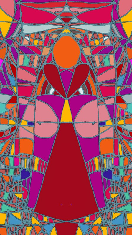
I had an idea - I created a new layer and rotated that one - I was shocked to see the symmetrical image that appeared. I merged the layers and kept working.

Can you see the figure that appeared?  Every time I try this process I discover something new. Truly, I am feeling creative every day.

Monday, November 12, 2012

L is for Lovely Lavender

Lavender Clematis
Last summer I was asked to design an art class for our local clematis test gardens. Lucky me.

To prepare, I spent hours in among the flowers, looking, analyzing and taking photographs.

Clematis grow on vines in lush clusters of blooms set on dark leaves.  They come in a rainbow of colors and sizes, from darkest purple to creamiest white. I took hundreds of photos. Then I spent many more hours learning how to draw them.

Today, a rainy and dreary day, I felt the need for some floral loveliness, and turned to my photos for cheer. Spending time among my floral photos was like returning to the summer garden. With so many choices, it was the beautiful lavender of these flowers, the soft red of their centers and the way they are set against that greens from light to dark that grabbed my attention and said, play with me in Photoshop. So I did. It brightened my day. I hope it does yours as well.


Saturday, November 10, 2012

J is for Jewel colors

Tobi Kibel Piatek
Golden Apples Hang Like Jewels
Amber, topaz, citrine, tourmaline, even carnelian and a touch a jade and amethyst - these are the colors I see in this digital image of tiny, jewel like golden apples dangling from a tree on an autumn evening.

Several years ago, I knew it was time to stop sitting at a computer to write and create digital art. I knew it would be good for my health to work away from my desk.And good for my mind to learn something new. So I began to paint and draw. In the same way I would lose hours playing with color and texture and effects on my screens, I now work at an easel or a large table - often standing. This decision has enhanced every aspect of my life. But sometimes, on my daily walks with dogs and camera for example, I take a photo that calls out for Photoshop. These tiny yellow apples are a perfect example. As I walked by the tree in the evening light, the last rays of sun lit them like jewels. I could not resist playing with them in Photoshop to see if I could turn them into something abstract and emphasize the golden light.


Tuesday, November 29, 2011

Cc is for Colorful Characters

One of my favorite ways to relax is to doodle images from a single line and see what appears. More often than not, my doodles turn into abstract people, and sometimes, faces. One of the challenge blogs I have been following describes these drawings as "one-liners" - a perfect description.


I use this method of doodling as a way to warm up - and then I like to color whatever appears  - this is my idea of relaxation. I drew and colored this lady with markers - and then decided to spiff her up a little with Photoshop.  My skills with this program have grown over the course of this challenge - I have learned to create many effects with ease. As usual, what I like best about this image is the color ... its always the color for me ... but so many lovely colors appeared I could not choose my favorite - so I am posting two. Which do you like best? Why?

Monday, November 28, 2011

Bb is for Bright and Bold

I have been trying for days to bring a mandala pattern that I drew into Photoshop so that I could work with it. The problems with this include (but are not limited to) capturing the image with my camera so that it is not warped, getting rid of the shadows on the page so that Photoshop does not see the darker areas as shapes, ensuring that the lines are dark enough to be read by Photoshop as complete lines, and that the shapes remain individual so they can be filled with color. Nothing really worked well enough - maybe I lack the skill to do it right.

So, when all else kept failing, I used Adobe Illustrator to create the basic template for this, and then brought it into Photoshop to color and work with effects. I probably could have done it all in Illustrator, but I am more familiar with Photoshop. I love the results, but more than that, I love the feeling of having figured out the solution to this problem.

Saturday, November 26, 2011

Z is for Zinnias

YAY! I've made it through the alphabet, though not yet through the entire month. After 26 days I really feel like I am in a productive and creative zone, and glad to be meeting my own goal of creating and sharing something everyday for this month.
Today's work is based on a photograph of zinnias - it is done in Photoshop.

Once again, setting out to plan a painting, I have combined digital effects that result in an image that reads as a painting, and provides me with the guide I need to move to the canvas. However, once again, I feel like this stands alone as a work of art worth sharing.

I have always loved making computer art. I have decades of experience in graphic design using all kinds of computer art tools - CorelDraw 1 anybody?  But I used to feel guilty about using my tools to create "fine art."  Lately though, the more I experiment, the more images I create, the more my point of view shifts. I think art happens where and how it happens -

For me, using digital tools allows me to build my visual and my technical skills. They also enable me to accomplish another of my goals for this month - to understand how to abstract an image. As I play with Photoshop and Illustrator, I begin to see how to simplify, how textures and shapes combine to "read" as flowers, or seascapes or sunsets. Most of all, no matter where the working takes place,  I am LEARNING everyday and with every piece.

How do you feel about painting in Photoshop or other digital tools? How do you use them in conjunction with your art?

Friday, November 25, 2011

Y is for Yellow

Yesterday was Thanksgiving, complete with a torrential and windy Pacific storm that seemed to tear the leaves from the trees. This morning, the sun was shining, and our morning walk revealed that there were still some leaves on the trees - yellow ones. Those hearty maples are lending their golden glow to distract shoppers from Black Friday :-).

Today's image is a combination of two leaf photos, Photoshop manipulation, to do two things, bring out details and enhancement  the gorgeous colors.

Friday, November 18, 2011

R is for Red


Its a red red red red world out there - at least for now. Storms, wind and rain will probably tear down this incredible beauty by tomorrow, but today was a perfect opportunity to record the remarkably rosy abundance of leaves.

Meteorologists are blaming the incredible intensity of the leaf colors on our unusual summer and fall weather - whatever the reasons, the results are spectacular.

 Of course, I can not simply take some photos and leave them alone. Last year, for the challenge I created another leaf design - using gold leaves. I wondered what would happen if I played with this red image  -


This is the result  (thanks Photoshop) and thanks Ronaele for the inspiration :-)


Wednesday, November 16, 2011

P is for playing, peppers and Photoshop

Today is Art Everyday Month, day 16!

I have had a busy day. I taught 18 kids in my Young Rembrandts class this afternoon and spent the morning prepping. 

There was grocery shopping, dog walking and dinner prep in the mix too. By the time I am getting around to making my everyday art, I am out of ideas, and out of energy.

But, I am determined to do something everyday, so I opened Picasa and started scrolling through my pix seeking inspiration. Last summer I had a huge harvest of wild looking peppers - I took many pictures of them, and even drew some. One of my favorite photos swam into my vision. OK - P is for peppers.

The pepper in the photos are bright bright red and green and shiny  - somehow the colors are not grabbing me tonight - but the wild curvy shapes are interesting. So, I opened the image in Photoshop and just started to play - there is lovely music playing in the background, and frankly, trying filters and effects on photos with Photoshop is my idea of relaxation. I think the results are relaxing too - and so different from the original image. They have gone from garden reality to undersea abstraction with just the clicks of a mouse.

Once again this brings me to the value of this challenge - I am amazing myself with the variety of approaches I have at my fingertips. I feel like I am stretching and building my art muscles each day. Today's image suggests an idea for a painting .... so, who knows what tomorrow will bring.

Tuesday, November 15, 2011

O is for Online Learning

One of the many benefits of this Art Everyday for a Month Challenge has been the opportunity to spend time on other people's blogs - looking at their work, reading their posts, and sometimes, following through on their suggestions and recommendations.

Today's art is the result of a link I found on an AEDM  blog (I am sorry I don't recall which) for a free online class   "The Mandala Free Class, A class to introduce and teach you how to do great Mandalas from a simple template."

The class is taught by Guadalupe Brizuela Cabal.

I love mandalas, and I love to take classes, and I love to learn online. Most of all, I love something FREE. So,  I clicked through, signed up, and waited until the class was scheduled to begin - this morning.

On the site, as promised was a terrific video, as well as a materials list, templates I could use, and a discussion group. Who could ask for more? I learned so much from watching the first lesson that I did not even need to use a template. I dug out my excellent compass, ruler and triangle and drew a very light square on a sheet of drawing paper and designed a mandala following the directions I had just watched.

Gualalupe suggests coloring with watercolor pencils. I have a fine, and underused set I bought in Paris, and though I love them, I do not think they gave enough visual punch. Since it is suggested that we post images of the mandalas we create to share in the class discussion, and anyway, since this was going to be posted here too, I took a digital pic and brought it into Photoshop where I really went to town trying out lots of effects to strengthen the image. These are the results.

There are several more lessons still to come online - and others are invited to log in and join the class, here is the link again 

 I recommend the class, and I believe that online learning is ideal for visual thinkers - so check it out, sign up, and if you create anything, post a link here too.

Tuesday, November 8, 2011

H is for How-to


I love to combine Photoshop with drawing, or use it to make digital pictures look like paintings, or enhance an image, or design a card, or, or, or ....

Photoshop is not an easy tool to master (in my opinion). Though I was adept at many other graphic and photo editing programs, (often self taught), I needed real help to learn how to make the most of this tool.

Even after years of use, I have only scratched the surface of its potential. I first learned how to use it by taking an online course. This was a great - I had all the time I needed to practice the lessons and the techniques on my own computer and my schedule. It was kind of an art everyday challenge in itself. When I was done with a lesson I posted it to the class website and had the benefit of class and teacher critique. Not only did I learn a lot, the positive comments really boosted my self-confidence, and the results of the lessons often became the basis for graphic design projects for my business.
Now, one of my favorite ways to expand my skills and try out new techniques is to explore Photoshop tutorials online for inspiration.  Sometimes I look for something particular (once I needed to create bubbles with faces inside - and yes, by combining several tutorials, succeeded.)  Often, I just happen upon an idea that appeals to me and try it out. 
Today's image is built on one of my favorite photos. I took this at sunset one night at the beach - I loved the warm light of the original, so I decided to try the process described in a tutorial I Stumbled Upon to enhance the light and see what happened.

Which brings me to a caveat about tutorials - not all of them actually make sense to me - this was the case with the one I worked from. I don't think I did it right - but, I accidentally created a beautiful texture layer which, when I combined it with the original image, added a depth of light and warmth that I really like. Sometimes the mistakes lead to the best outcomes. When I completed the tutorial steps, I began to play with this using some of my favorite tricks - and this is the result.
I see lots of comments from other AEDM participants about  the challenges of using Photoshop. I suggest googling Photoshop Tutorials (or go to the Adobe website) and see what you find. Try them out ... share what you create. And, don't be afraid to mess up - you never know what might appear.


Sunday, November 6, 2011

F is for Fun with Flowers Day 6

Talk about mixed media, today's image started as a digital photo of a lotus like flower. I used it for the basis of a drawing in black and white to get a sense of the shapes. I liked the simple drawing so much I photographed it.

My plan was to paint this flower on canvas - I worked on it for several hours but I was not getting the vibrancy I had in mind. I will continue to work on the painting -   but I liked the shapes and composition of this flower so much, I opened the black and white sketch in Photoshop and began to apply color.

A little wild? Maybe. But its a dark and dreary November day and I am in the mood for something fun. I hope you are too.

Tuesday, November 23, 2010

Art Every Day: W is for Winter

Day 23

Winter has arrived with an 'Arctic Blast' to our usually temperate region. The frost and some snow are truly on the pumpkin, and some tiny pears that never developed on the tree. I love the way one is still growing upwards (they do that till the grow heavy enough to turn downwards.)

For me, winter is always the time of wishing for warmer weather. The yellow in these pears brings a little sunshine to the coldest day.

This is a combo of Mother Nature, digital photography and Photoshop.

Sunday, November 21, 2010

Art Every Day: V is for Variations

Day 22

There were a few sun breaks between the rain yesterday, so we (husband, dog, camera and me) headed out for a walk. I photographed a fairy ring (a perfect circle of mushrooms) growing on the bark dust in the park. There were fallen leaves everywhere - yellows, brown and red.

Separate from the masses of fallen oak and maple leaves on the ground, was this ... lone birch or aspen leaf. The simple, single heart shape and golden color stood out from the rain wet tarmac.

I like this image so much, I could not resist playing with it in Photoshop. After tinkering around, I had several variations. I think each one works on its own, but, like a good marriage, I think they are even more effective together.