Showing posts with label #aedm2015. Show all posts

Monday, November 30, 2015

Dd is for Dark December Day

Done. This is the last day of the 2015 challenge and I have succeeded in posting something everyday.

Today, a digital image based on a photo taken on a dark day last December. In spite of the clouds and the early dark, there was intense light filtering through the clouds. I tried d to capture and enhance the intensity and contrast of the light against dark.

Taking part in this challenge has been a little bit like that - so much darkness in the world, and yet so much light in my life and in all the creative work I have seen this month.

Thanks for all who have taken part, shared their work and ideas, commented on this blog and on Facebook. As always, I have learned a lot and had a double dose of fun.

Til next year.

Sunday, November 29, 2015

Cc is for Creative Collaboration

This image is a collaboration between me and the sea.The pattern is created by the action of the tides on the sand and beach rocks.

I don't think this needs any enhancement from me - my job here was merely to notice, capture and share this tiny moment of nature's art.

Tomorrow is the last day of the month and the challenge. Phew!

Saturday, November 28, 2015

Bb is for Beautiful Blues

Today's image (12x12) acrylic on canvas was created by playing with three shades of blue acrylic paint and white as a mixer. I love messing around with a limited palette because the results can be surprisingly strong.

To start, I flowed a line with a red paint pen - then I starting mixing the blues to create a variety of shades. The top patterning is done with a new favorite tool - a white acrylic pen made by Sharpie. I am very impressed with the quality of these pens - long lasting, a fine strong point and excellent flow control.

Thursday, November 26, 2015

Z is for Zoom

It is the day before Thanksgiving and their is lots to do.

I have little time, but I am determined to be creative every day (for this challenge, cooking and decorating the table does not count.) So, last night I grabbed what was handy on my work table - pink construction paper (rough stuff) and my Caran D'ache.

 Since this is Z day, I was running Z ideas through my mind. I remembered learning to write a cursive z in 4th grade. I thought then, and still, that it was the most beautiful letter. So, I used Shaprie to write big swirling beautiful flowy Z's large and small in every direction. To add contrast, I threw in a few zig zag non cursive Z's as well. And a few more nice lines to break up the space.

I find that my favorite crayons are quite wonderful on the rough surface of this cheap paper - so I colored each shape to see what would appear. The texture really added to the effect.

This image came together so quickly that I had time to pop it into Photoshop to play. I think the abstract and vibrant results are a great way to close out the alphabet. Tomorrow, we begin again.

Wednesday, November 25, 2015

Y is for Yellow

Yellow is sunshine and daffodils and springtime and warmth.

Yellow flowers are all of these things and a perfect way to celebrate all the things I am thankful for on this practically pumpkin and turkey feather day.

This image started as a drawing and finished in Photoshop to push the color and contrast. I was seeking to show the light against the darkness - kind of the way I feel these days. There is so much to be grateful for, and so much that is dark and scary out there. Flowers sooth the soul.

Happy Thanksgiving - peace, joy and plenty to all.

Tuesday, November 24, 2015

X is for eXpression: Creative that is

CREATIVE 

ADJECTIVE


  1. relating to or involving the imagination or original ideas, especially in the production of an artistic work: 
This Art Everyday Month Challenge is fascinating. 
Every year it is an opportunity to see, admire and be inspired by the creative work and ideas of a highly diverse group of people. This year especially, I am noticing artists from around the world.

 How wonderful that people of different ages, styles and skill levels are all brave enough to express their creative selves to the world. 

To keep within my X theme, I would say that the work is eXcellent, eXciting and eXtremely well done. 

I appreciate the eXtraordinary effort involved in being creative every day. So, for today, something 
eXtra lovely to share- flowers - a digital photo from a summer walk-through at the Farmer's Market. 

Monday, November 23, 2015

W is for White

W is for white. Titanium white acrylic paint that is.

I love to paint white flowers. I love to layer coat upon coat of thick white paint to create depth and texture. I especially love to balance the brightness of the white paint with deep or dark colors.

This painting (16x20 on canvas) is inspired by trillium that grow wild in the woods in the spring. While out walking I looked down and saw a cluster of them, surrounded by their glossy dark green leaves. I liked the idea of a painting from that perspective - looking down into the flowers.

Painting flowers is like preserving strawberries into jam. It is a way to keep the pleasure all year round.

Sunday, November 22, 2015

V is for Vibrant Violet


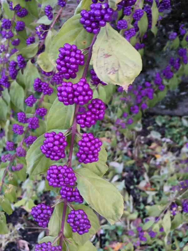
I was out walking the dogs yesterday when I noticed an incredible cluster of violet berries on a tree. I took lots of pics, because I knew they were the perfect solution to the question, what is for V day? Sometimes creative thinking is done for you - if you remember to look. So, maybe V is also for Vision  (and I am grateful for mine.)

Does anyone know what these berries are?

Saturday, November 21, 2015

U is for Unafraid to Fail


Friday, November 20, 2015

T is for Triptych Three Times

Mine
7 years old
I stumbled upon (or rather Pinterested) a wonderful idea for a simple lesson that would work with my seniors. Divide a long narrow sheet of watercolor paper into three six inch squares. Triangles in one, squares, then circles. Use lines to create background shapes. Then color with Caran D'ache. The instructions were open-ended and the results were fabulous. Everyone 'got' the idea and worked well. Best of all, everyone loved the results. Aren't they beautiful?!?
Almost 13

eleven


So I decided to try with both of my kid classes today. It was a slam dunk with the young kids and a really great project for my sophisticated and skilled older kids. Oh, and I loved it too. I have done several of these now myself.
Senior Student


Thursday, November 19, 2015

S is for Sunset

Yesterday was about making it rain. And boy it did!  I hated driving home in the dark and torrential downpour. So, today I want sun.

I spent last winter traveling to warm places (and can't wait to leave again.) As I have written before, almost every evening was an opportunity to capture a sunset with my camera. When I got home, some of the images called out to be painted.

 This painting is one of my favorites because it captures both the light and the dark (and a place I long to be again.)

Acrylic on canvas - 12"x24".

Wednesday, November 18, 2015

R is for Resist

This being November and Oregon, it has be RAINING .... a lot. The grey skies and constant broken light inspired this fun project which I call "Make it Rain." I used this in all of my art classes last week with consistently great results.

First, we create a place - in my senior classes I demonstrated a street of houses on a horizon line. These were colored heavily with bright colored oil pastel. I reminded students that any area that was to remain white needed to be covered with white oil pastel. Then we covered the entire image with a coat of black water color. Voila! It's raining.

We had great results in all the classes. My younger kids followed the houses on a street pattern. My older kids took the opportunity to create their own imaginary and highly original "places." Almost everyone loved the effect of the watercolor resist.

Maybe next time we will bring on the sun.


Tuesday, November 17, 2015

Q is for Quantity or is it Quality?

I have written about encouraging my students to play with the same ingredients to create many images. This is actually a variation on a creative thinking technique - brainstorming - generating MANY ideas - some which will be good, and others which we may discard and move on. All of which are worthy of consideration.

In my classes, I believe that I am teaching more than art lessons - more than techniques and fun projects. I am teaching creative thinking and problem solving skills. And I am teaching kids to learn to trust their ability to find  solutions.

I believe that creativity is as much about attitude and confidence in yourself as it is about talent. I want my students to learn that when we make art, we are not looking for one right answer, or one image that is the same as everyone else's. I want them to be able to look around them and see many solutions to the fun challenges I present - and understand that art (that any creative work) is highly personal. We are all different - why should our art all look the same? And, to be comfortable with the knowledge that it takes practice to learn, to improve and to discover your own strengths and particular interests.

Working in a group - drawing or painting and producing things that everyone can see is a risk. Yet in every class we share what we have created, evaluate what has worked, what could improve, and praise what we like. I want my kids to feel proud of themselves for  being brave enough to jump in and use the ideas they find in their own imagination. And to appreciate effort and originality in others.

To help them feel safe and confident and relaxed, I remind them that it is good  to generate MANY ideas; to test many solutions, to experiment with techniques or materials in different ways, to produce different results, and most of all, to accept that sometimes the results are not what you hoped.

I believe and I teach that mistakes are teachers too. We learn what we might do better. We discover that even work we do not like can include one square inch that is just right. And, sometimes, we put the trash bin to use. (Or, we recycle unsuccessful work into something new.) And we recognize that by doing things many times, by practicing and building skills, the quality of our work and our ideas improves.

The image on this page is from my vast series of sea and sky pics. Taking large quantities of photos absolutely results in several of good quality. Also, the wide open sky and sea speak to me of endless possibilities, and I like it.

Monday, November 16, 2015

P is for Playing with Possibilities

A student mentioned that she had learned about an artist, Gabriele Munter, at school. I was unfamiliar with the artist, so I looked her up - (what would I do without the internet.) She paints florals, faces and landscapes with lots of color, flat plane and an abstract feel. I describe my own work in the same way. I especially liked her florals because mine are so similar in style and feel.

So, I decided to try to copy one of her paintings, but instead of paint, I used Caran D'ache on watercolor paper. I liked the arrangement of her flowers, but I changed up the leaves.

I had a few thoughts in mind for this drawing - one - this would be a great way to introduce some color blending techniques to my students. The flowers are colored in different ways - some are rings that are blended, others layers of color that are also blended to create both new colors and some pattern .

Also, I have been playing with wetting my Caran D'ache drawings and creating "prints" on rice paper - this as an idea for fabric design to use in my Art of Fashion class.

I played all day - ending up with a delecate rice paper print, a full scale painting, digital prints with different color backgrounds, and a really satisfied feeling. I had fun, and I have enough ideas stored up for my entire week of teaching.

Sunday, November 15, 2015

O is for Open-ended


o·pen-end·ed

(ō′pən-ĕn′dĭd)
adj.
1. Not restrained by definite limits, restrictions, or structure.
2. Allowing for or adaptable to change.
3. Allowing for a spontaneous, unstructured response: an open-ended question.

This month in my painting and drawing classes, my lessons prompts and rules are open-ended. In other words, I set some rules but leave the choice of subject or pattern or color to my students. They tell me often how much they love this freedom. An open-ended assignment means there are no wrong answers, no one way to work, and many options for expressing ideas. 

Open-ended assignments are a little daunting at first, and then an idea will hit. "Can I do this?" "I don't know ... are you able to do this?" 

They are a way to generate many ideas and explore design elements. This assignment was to create four images, on one page. Each had to follow the same "recipe": 
    3 Triangles, any size
    5 squiggly lines (squiggly to be interpreted by the artist)
    7 circles
    COLORS; red yellow and blue. White for blending if desired and sharpie for outlines.

The results that come from these instructions are strikingly unique. It is so much fun, at the end of class, to look at all the ideas that have come to life on our papers. We are going to do this again next week - but in a new medium and with a new instruction added for a fun twist.

Open-ended assignments are definitely an opportunity for my students, and for me, to discover what we want to create, to stretch our imaginations and learn new techniques - all at the same time. 

The art of this page includes mine (at the top) - I did a full page in prep for the class and then "doubled the recipe" on one to see what would appear. Then I colored it.  Notice how the sky treatment reflects the one in my H is for Hippie post.

 I loved that the kids had the time to complete their full pages. I think they are beautiful. And, they truly demonstrate the idea that Creativity is Intelligence at Play.

Saturday, November 14, 2015

N is for Negativity

Its not that I am never guilty of it, in fact being negative about my own art defined me for many years. But now, especially as a teacher of seniors, all the negativity from my senior students is driving me nuts.

I am trying to figure out why, especially older women, can never find anything nice to say about themselves and their work. Its not that they don't know how - their praise to others is lovely and right on the mark. Yet when they look at their own work, they call themselves names (I am no artist!, stupid, ugly!) and refuse to acknowledge what others clearly see in their efforts. They never are even willing to acknowledge the simple fact of their effort and willingness to try. (BOO!)

Is this a cultural thing? Women of a certain age taught to be humble and self-effacing?  Is it true humility? Is it a way to get attention and praise? I don't know the answer, but the issue is not new to my current teaching situation.

I love embroidery - especially the beautiful and complex Russian embroidery I would often see in the homes of my husband's family friends and relatives. Yet whenever I commented on the beautiful work, the maker (always a woman) would say something along the lines of ... "oh it keeps me busy." Or, "its nothing."  Same for handmade sweaters and embroidered linens, and so much other work of women's hands.

This beautiful and handmade work is and was what inspires me to create - to make things - yet I long to see the well-deserved pride in craftsmanship that should accompany the satisfaction of creating something beautiful - and of working hard at something to achieve a completed piece.

That's my rant for the day. The art on this page is actually a digital creation based on a long-ago self portrait - of the me who was more negative about her work.

Friday, November 13, 2015

M is for Makery

Makery is a new word to me. The idea and the word has popped up, literally in my own neighborhood and I can see it becoming a new trend. A makery is a place where tools and training are provided in a work space - for a price.

I now teach classes in a "makery" - a shop where kids and adults can learn to sew or cook or bake or embroider or knit or draw or make earrings or  sausage or ... the possibilities are endless. There is another makery around the corner from the place where I teach.

A search on the word makery includes shops and studios around the country, and include words such as artisan, unique, DYI, handcrafts, "making things from scratch" and "homesteading skills to build self-sufficiency." My daughter has a school to teach cooking.

I have noticed shop front businesses where you can go to drink wine and create an instructor led painting; shops for painting pre-poured ceramics which are then fired for you. There are jewelry making classes at the bead shop.  I found one that is suited to "inventors of all ages." There are classes to teach how to make wine and beer, ones where you can learn to make preserves, pickles and jams, even cheese from scratch.

As a long time "maker" who learned many of my skills from parents, friends and relatives, I find it interesting to see a whole new business model popping up to provide the skills that were formerly taught in school and at home.

 Now that home economics and art and shop are no longer part of the school curriculum, these shops are a way that kids (whose parents have the means to pay for classes) can to learn the pleasure of working with their hands to create something that is truly their own.

As a life long and passionate "maker" of things,  I understand the satisfaction that comes from creative work, and I love the opportunity to share my skills. But, I see these cool shops as a reflection of how our world is changing. What were once essential skills of daily living, such as cooking, baking, sewing and knitting warm clothes, are now recreation. And now, the definite favorite of almost every school kid, art, is no longer free and a regular part of the school week. These shops are wonderful - but I am aware, even as I teach my lucky students, that the skills and the pleasure are pno longer available to everyone.

For those who can afford it - no matter how we come by the skills and pleasures of making things .... its a good thing.

The art on this page is a "kitchen art" piece with a touch of photoshop to soften the edges.

Thursday, November 12, 2015

L is for Lovely Luminous Light

This image began as a photograph of winter dry bushes reflected in a puddle.

I loved the hot color of the bushes and the bright cool  blue patches created by the sun shining on the water.


It was strong in its original form but  I wanted to see what I could do with it in Photoshop.

With just two tweaks, the image was transformed from photo to painting and I am thrilled with the  light, airy and luminous feel of this piece.

For me, image editing is a wonderful way to be creative and calm at the same time.

Wednesday, November 11, 2015

K is for Kitchen Art

Kitchen art, for me, usually refers to a bowl of fruit or teapots or other cozy images that suit my favorite room. This piece may work in someone's kitchen, but it was created in mine.

One of the techniques I revisit from time to time is monotype printing. I have modified the more traditional approaches I have learned in classes and books to meet the needs of my senior students. It is so easy and so fun that I do it for myself whenever the urge hits.

But, because this method involves water, and soaked paper and spoons and a rolling pin (!) I find I do this best in my kitchen on the big counter under the lights.

This piece began as a drawing in caran d'ache neocolor watersoluble crayons on acetate. It is printed on wet cotton paper 9x12.

 It is always interesting to discover which details transfer over, which ones get lost, and how the changes effect the overall piece.


Tuesday, November 10, 2015

J is for Jumble and Junk

My studio is often a jumble of ideas, materials and the leftovers from completed or in process works. In other words, there is a jumble of junk that waits to be incorporated into something new. I have created fun paintings with leftover paints, collages with bits and pieces of colored paper, and  drawings with scraps of pastel.

Today's works was a way to use up a puddle of gel medium, some rice paper and some leftover paints. The combination of paper and paint, line and dots line create texture and depth. Very abstract in concept and execution - and just a lot of fun to make - no plan, no worries, and fun to look at.

This is 8x10 on canvas.