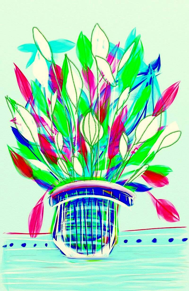
Showing posts with label #aedm2016. Show all posts

Wednesday, November 30, 2016

AaBbCc Dd Delicate Details

Another year another challenge. Done and done.

I missed the last three days, but I do want to post a final piece to complete 2016. This floral photo is so delicate in color, shape and detail - it seems like the perfect way to close this year's challenge.

I don't know what these are - but I loved them the moment I saw them, and captured their beauty with my camera.

Thanks everyone for the beautiful and varied art you have shared. Thanks for kind comments and helpful tips.

Till next year.

Saturday, November 26, 2016

Z is for buZZ

Today is Z day, and I have very little to say that relates to this difficult letter - but I do have this glorious rose drawing complete with buzzing bee to share.

This was drawn with color pencil on vellum and then I digitally added a color overlay to give it extra zip and zest.


Friday, November 25, 2016

Y is for Yesterday


Yesterday was Thanksgiving. It was a beautiful day if you don't count the torrential rains that fell throughout the day. They barely dampened the pleasures of my favorite holiday.

And, of course, dinner was delicious; the birthday boy was too.

Yesterday made me happy - so it is no surprise that the art that appeared today - a combination of painting and digital effects -  resulted in a garden of vibrant colors.

Thursday, November 24, 2016

X is for eXquisite

I found this exquisite double white rose on a single twig of a rose bush hiding among the weeds in my garden last summer. I have never seen a double rose before.

Since I will not be making art today, instead, I will be cooking and eating and celebrating, I am sharing this beautiful sample of nature's art.

Happy Thanksgiving

Wednesday, November 23, 2016

W is for White

My mother grew gardenias on the fire escape of our Bronx apartment. Every June our home filled with the intense and gorgeous perfume wafting from the crystal bowl where she floated the clipped blossoms.

I have not inherited her green thumb, and all of my attempts to grow the flowers, much less keep the plants alive have failed miserably. Until this summer.

Two Mother's Day ago, my daughter gave me a lovely little gardenia plant (one more chance) and somehow this one not only lived, but thrived, and low and behold, one year later, bloomed. This is one of the beauties that resulted, preserved now in memory and photograph,

On this day before Thanksgiving, this white flower helps me remember all of those I am thankful for.

Tuesday, November 22, 2016

V is for Vacation

To me no vacation feels right unless it is includes time enjoying the sea and sky.

I am lucky. I get to spend the winters where the beaches are beautiful and the sun shines most days. Best of all, I get to watch the sun rise and set over the Pacific almost daily.

And everyday, I try to capture the ever changing beauty with my camera, When I get home, I continue to enjoy my vacation by revisiting the beautiful skies in my art.

This pastel piece is drawn on a sheet of beautiful
turquoise Canson Mi Tiente paper that I bought while on vacation. I love the way the background color of the paper enriches the overall image - making it easy to recreate the light on the water and in the clouds.

Monday, November 21, 2016

U is for Undo

One of the reasons I became completely enamored with creating digital art is the UNDO button.

Before I had the ability to step back in time and remove or rethink, my art process was a constant interior battle between what I envisioned with what actually appeared. Then  I began learning to use CorelDraw.

I was so engrossed in the process of learning this new and fascinating skill that it began to color my non-digital life. I recall planting flowers in my garden, placing one in the wrong location and thinking I could simply click and start again.

Now years have passed and I have mastered many new digital art tools, but the pleasure of being able to step back and do it again, without ruining the whole, or figuring out how to work the error into the finished piece has never dimmed. I am not perfect - but the undo buttom helps me create better work.

Now if only it worked on other aspects of reality ...

This little floral was created in Art Rage using several different brushes to create the different shapes and lines.

Sunday, November 20, 2016

T is for Three Layers (twice)

Student sample
Three layer paintings are always a big hit in my painting classes. We start with a line - a pattern, a word, a energetic feeling. Then everyone receives a palette with red, yellow, blue and white paint and a test strip so that they can experiment with mixing the colors. This is my favorite part of the lesson, as shades and mixes begin to appear. This is basically a color-field painting.

Students paint each area - taking care to keep colors separate.  Then, when the paint is dry, white and black markers or oil pastels are used to draw patterns and lines on top. The results are always fabulous and everyone is successful.
Just for the fun of it, I doubled one of my three layer paintings in Photoshop, flipped one and then blended the two images.

Friday, November 18, 2016

R is for Ready and Results

I am ready. Finished the ten pieces I am submitting to the Big 500, Peoples Art of Portland show. Finally.

This project which I thought would be easy was a challenge for me on a number of levels. Now that I'm done I am pleased with the results.

When I first started to work with them, I found it very difficult to make acrylic paint look good on the 10 8x8 boards provided by Chris Haberman who runs the show.

Though I had some ideas for images, nothing I tried out was remotely working for me. So, I tried to search online for examples of other works created for previous Big 500 shows, I did not find much.

To add to my angst and fear of failure, my very dear dog, Rosco, had passed away leaving me sad and not creative. I needed inspiration.

Then, as so often in my life, two times in a day, from two different people, the same advice - paint all the boards as one piece. I could begin - though I had no theme or plan beyond the most basic and easiest - take a line for a walk across the surface of the 3x3 square of nine blocks. I gessoed as recommended. Then brought out the colors.

I thought about what thousands of art covered squares in a gallery would look like - and how I could get anyone to see, let alone buy, my paintings. COLOR! Its what I do best. Limited palette, paths of color flowing over the surface. Hot and cool. The paint looked horrible. I felt absolutely discouraged.

I experimented with adding water color crayon on top of the paint layer, rubbing with pastel, over painting with a single color, nothing worked. Until I thought about drawing lines and patterns with acrylic paint pens on the surface of the paint. Finally !  Once I got started it was easy, and I really enjoyed the freedom to just play with the shapes and patterns.

So, here are four of the ten pieces. The moon picture I showed yesterday is also in the collection. The pieces will be displayed randomly throughout the show - which is too bad because I think they look awesome in a group.


Thursday, November 17, 2016

Q is for Quest

Q is also for quick today.

Lately I have been exploring different digital apps and programs - just for fun and to study different effects on the images I photograph or create.

Without a doubt, the Iphone app called Prisma is one of my favorite discoveries for quick edits and fascinating results.

This is a photo of my neighborhood in full autumn splendor. I love the way the effects transforms my quaint little 'hood into something wildly beautiful.

Wednesday, November 16, 2016

P is for Painting

This little painting started as a way to use the extra paint on my palette but soon took on energy of its own, As with so many of my larger works, this is a mysterious place that invites me in to take a longer look around.

There is something about starting with no plan and letting the paint and the texture take its own path that I find endlessly fascinating and often results in my favorite pieces.

This is acrylic on canvas - 10"x10"

Tuesday, November 15, 2016

O is for Over the Moon

I notice that moon images have been appearing in lots of my work lately.

I am not exactly sure why, but it is a change from the suns and sunny compositions I was doing.

Then again, things feel dark these days and the moon is an excellent source of illumination.

And, of course this is also the time of the Super Moon, so maybe that is the explanation for this little piece which is part of the ten boards I have painted for the Big 500 show.

Like the others, I gessoed the board, layered with acrylic and topped with acrylic paint pens. It was a lot of fun to do - just letting myself add lines and dots and color as I pleased.

Monday, November 14, 2016

N is for November

In November, as the days get shorter and darker, and the weather gets cold and damp, I begin to long for warm weather, sunshine and bare feet. In other words, I am ready to head to California for the winter.

However, the time is not yet right to leave, so I find myself revisiting photos I have taken while traveling to warm places.

This one is a favorite - showing exactly what I love to do, stand at the water's edge and take photos of the sunset.

Once I have the pics, and especially while on the road and away from my full collection of art supplies, I love to experiment with the digital apps I have on my phone and tablet. Here is the result of today's experiment - looking forward to winter, ocean and places where it looks and feels
like summer.

Sunday, November 13, 2016

M is for Matisse

More to the point, M is for manipulating a Matisse style paper cut I created for a summer class.

With the ability to view the gorgeous Matisse exhibits at distant museums this summer, I have been once again moved and inspired by the gorgeous paper cuts he created. I used this technique in classes I took this summer, and often in classes I teach.

This morning I revisited a favorite pear inspired collage in the style of Matisse and played with it in several digital modes. This version - so bright and sunny feels like the perfect post for a dreary day.


Saturday, November 12, 2016

L is for Look

Pay attention, notice, open your eyes, observe  LOOK. This is one of the key messages in any art class. When I work with young students I encourage them to pay attention to the details they see. In a fashion class it is the lines of a garment they are designing, or the way the pattern is affected by the shape and position of the body beneath.

One of the best tools in my arsenal of teaching strategies is encouraging kids to look closely at flowers. We look at pictures, and handle real blooms, even taking them apart to see how they are made.

What is the shape of the center? What colors do you notice? How do the petals attach? Do they overlap? Then, we practice drawing flowers based on geometric shapes - just for fun. It is my intention in this lesson to encourage my young artists to let their design ideas begin to flow, to feel free to create their own flowers, express their own ideas, create interesting combinations and compositions. This is always a fun project.

Today, this is a floral I painted in Paint Joy following my own example
- simple shapes, repetition and lots of texture and color. I simply like to look at it.

Friday, November 11, 2016

K is for Kitchen

K is an easy letter for me. Some of my favorite artists have K names - Kandinsky, Klee and Kibel.

But K is also the letter for my favorite room. I frequently find inspiration in the kitchen. I love to cook and I love all the lovely objects that are part of cooking and presenting good things to eat.

My teapot series began as a project for my senior students - and just grew from there. I loved the idea of encouraging my "ladies" to create a party on a table. I demonstrated several ways to draw and paint the teapot and let them go on from there. Lots of wine bottles and glasses appeared ;-)

But, I started a teapot in the lesson and brought it home, where I found I could not stop working on it. The teapot and then all the other objects became a palette for designs and patterns, and my favorite cookies. This is done is color pencil - prismacolor - my favorites because they yield such rich color.

This is one of my favorite pieces from the series. The others are getting ready to go into a show.

Thursday, November 10, 2016

J is for Just Do It

On this day of jangled nerves, jumbled thoughts and jagged emotions, I am not feeling especially creative. But, because a promise to work this challenge every day is a promise, I know I need to just do something.

Flowers are calm, blue is both beautiful and reflects my mood. This is a small drawing - Caran D'ache on heavy watercolor paper. I tweaked the texture in Photoshop because I can,


Wednesday, November 9, 2016

I is for Inspiration

It starts with an impulse to draw something -

As an art teacher I constantly think about ways to bring new ideas and techniques to my classes. I like to offer my students many alternatives for expressing their ideas. So we work in lots of different mediums and experiment with many different approaches.

The other day, as I was looking for a recipe in my Polish cookbook, I was instantly inspired by the beautiful paper cut patterns that decorate the pages.I had an idea.

In my classes, everybody likes to work with markers, and we have a good collection to work with in both places where I teach, so, instead of cooking, I grabbed my PrismaColor markers and played with the paper pattern ideas.

No matter what my intent, I find that working with markers always result in patterning with lines - before I knew it - I had a page filled with leaves and flowers -


Tuesday, November 8, 2016

H is for "Highly Realistic" (or maybe hope)

I created this image with the Oil tools and brushes in Art Rage.

After downloading and playing with the free Art Rage Oils app, I invested $4.99 to purchase the full program. This is clearly the premier painting program available for Android users, described as "natural painting software." In my opinion, it totally lives up to its promise of "highly realistic" painting tools.

To create this sunset (sunrise?), I played with various brush choices and of course, colors. I loved the way this tool allows me to blend colors, choose hues and tints within the color menu, highlight parts with thin and delicate overlays, scratch through the paint with a thin brush, and all in all - have a very satisfying and higlly realistic painting experience.

Just what I needed on this horrific election day - here's hoping for a happy outcome - for all of us.

Monday, November 7, 2016

G is for Grapes Leaves

As I mentioned earlier, I took a painting class this summer with the wonderful Elena Guttman. In her Dynamic Abstract classes we explore different artists and apply her teachings about their style to our own work.

In a recent class about Picasso, we not only fractured shapes, but colored each shape with lights and darks and selected color.

I needed a subject to practice this technique. What should I draw? I pondered this as I looked at the sky I could see through the curtain of grape leaves that were curling over our arbor. There they were - lovely curling shapes, tendrils, overlap, gorgeous shades of green and sky.

I spent days working this image using hard color pencils on soft paper. Each area is painted individually. An interesting and difficult assignment - but worth the work. Its very different from my usual work. I havent't yet really incorporated this into other images - but maybe soon.