Thursday, November 29, 2012

Cc is for Clematis and Color

The end is near, two more days to go. I am on a tear with my new inspiration. Today's work is a drawing of a clematis enhanced with zentangle patterns.

However, I got a new pen today, and when I added a touch of color to the background with inktense pencil and water, the ink ran. BOOOO.

If I have learned anything in my life, it is that mistakes and problems are often the gateway to new discoveries and highly satisfying solutions. So....

A little help from my digital pal Photoshop allowed me to drop out the background. Then I added a gradient layer, just to try, and knew this was the background intended to go with this flower.

My final November post will appear on Saturday ... then, on to who knows what.


Wednesday, November 28, 2012

Bb is for Bold Blooms

I am inspired. The combination of flowers, lines, zentangle patterns and time to be creative allowed me to spend an entire day at work on this. I love the foreground flowers and the leaves, and the little patterns near the table top. Oh, and zoom in on the vase.

This is fine point markers, black and color, and inktense pencil for some POP. 9x12 on watercolor paper.

More tomorrow. Its great to have something new to focus on.

Tuesday, November 27, 2012

Aa is for Another (Zentangle) Abstract

How fun is this? I started with the idea of a symmetrical floral-ish design I found among the zentangle patterns - but, never one to follow the rules or the recipe, I soon adjusted it to become a flower.

All the zentangles I have seen so far seem to be black lines with color added. Really stunning and strong. What I especially like about them are the varied patterns that surround the main pattern.

So, though I chose to work in color, I followed overall idea by extending the flower lines (fractured images come to mind) and filled each area with a different color scheme and pattern. I love doing this. This is the art of my childhood, the doodles that filled my notebooks and my ongoing obsession with lines and florals all rolled into one fun art form. I am going back for more. So, watch this space tomorrow to see what appears.

Monday, November 26, 2012

Z is for Zentangle

As I mentioned yesterday, I was at a loss for a Z idea. Zugzwang anyone? Zebra? Zebra put me in mind of lines. Thinking about lines, I remembered that I when I posted a line drawing earlier in the alphabet, someone commented that it looked like Zentangles. I never heard of them, so I looked them up.

As stated on the website, "Zentangle is an easy-to-learn, relaxing, and fun way to create beautiful images by drawing structured patterns." Its like the official version of what I like to do ... something that combines design, doodling and finding shapes and worlds within shapes. Only who knew?

Immediately I watched a YouTube video, and understood that there are thousands of patterns and methods - all at a tap of my keyboard. They are incredibly beautiful - like fonts - each expressing a style or feeling. And, like fonts, combined to make words and convey ideas. COOOOOOOLLLLL.

So I have been looking and reading and admiring all day. I drew several patterns into my sketchbook. Looking for a clean page, it opened to a drawing I had begun last year - combining mandala and pattern of lines. I had colored different sections with soft pastel. I saw those empty shapes and I thought, Zentangle sampler. While looking through patterns on line, I tried them out on the spaces in the drawing. I drew with fine point colored markers that coordinated with the undercolor.

I feel as if I stumbled onto exactly the concept that my ideas have been waiting for. I am already well into another drawing and can't wait to see where this discovery of beautiful pattern ideas will take me.

Today's creative leap is the reason I do this challenge. By combining the inspiration and input from other participants, the push of daily practice, and constant attention to the art I will make next, I occasionally come to a place where I feel a have taken a leap. Today was like that.

Sunday, November 25, 2012

Y is for Yin and Yang

Yin and Yang. Y is that?
Using the alphabet as my structure for this Art Everyday for a Month Challenge blog has proven to be a good way for me to stimulate my creativity.

Within the alphabet limitations I not only need to create art, but each piece needs to fit into my self-imposed structure. Everyday I need to brainstorm possibilities for the letter of the day - and each day something comes to mind. Now, after three years of doing this, the end of the alphabet has not gotten any easier (still no clue what Z will be about tomorrow). So, I am sure you are wondering Y this is about yin and yang.

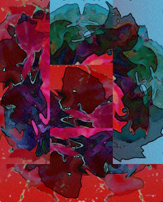
The image on the page is actually a drawing of a group of tropical flowers - first drawn right side up, then flipped and drawn again so that the images not only cross, but fit together symmetrically to create a new abstract pattern - yin and yang. Once the pattern was in place, I decided to ignore the floral roots and just play with the shapes to see what appears. This was another chance to experiment with Inktense pencils, and add a few lines and details in markers. I like it. do You?

This is 9x12 on watercolor paper.

Saturday, November 24, 2012

X is for Xtreme Color Xperiment

Lily
Last year, for Art Everyday Month, I followed a course on Mandala making. Many of the participants raved about Inktense pencils - watersoluble color pencils. I bought a set, and have rarely used them. However, since I am regularly playing with my Caran D'ache watersoluble crayons I thought I would Xperiment today to see the effects of the pencils.

I drew one of my favorite flower photos  on good quality watercolor paper - using the outline pencil in the set. Then I began to color - mixing three reds, and orange and yellow for the blossom, greens and browns for the stem and leaf.  The background is a mixture of blues to emphasize all the colors with a strong contrast. Then I added water. All I can say is WOW! The colors are so vibrant. I will definitely be continuing to experiment with these cool tools.


Friday, November 23, 2012

W is for Wide over Water

Tobi Kibel PiatekYesterday was a wonderful day that began with a family photo shoot under the St. Johns Bridge. It was also the day before my grandson's second birthday - so spirits were high and it wasn't raining. Who could ask for more?

This is my photo, taken while waiting for the rest of the family to arrive - tweaked a little in my favorite tool (Photoshop of course). I think this reflects the light, the brightness and the breadth of my feelings for the ones who gathered together and made this Thanksgiving day so memorable.

Wednesday, November 21, 2012

V is for Variation

Variations on a Fall Theme
Happy Thanksgiving - one day late.

Sometimes I like to simply mess around with Photoshop, photos, filters and effect and see what appears. This is today's ... variations on the same photo, layer upon layer, sliced and colored and combined and recombined. FUN to play sometimes ... my holiday treat.

This began as a simple image of autumn leaves on a table. This is one of my favorite ways to play with images. I never know what I will find, and I find it amazing to discover what can appear. Most of all, I like to give myself permission to simply play with no goal. This feels festive to me ... perfect for my favorite holiday.

I hope yours is a good one.


U is for Up

Tobi Kibel Piatek

 My "senior class" today was a delight. My preparation, which included printing a collection of large, vibrant flowers, and even pre-sketching a few, resulted in truly lovely work, and a relaxing  pre-Thanksgiving afternoon. To start the class I demonstrated how to mix and blend and deepen colors when working with Caran D'ache watersoluble crayons (which everyone loves). As my classes progress, my students (my "aspiring artists" as Lillian refers to our group) are growing more independent, and more skilled.

When things go well, and everyone enjoys themselves, and real learning has taken place,  I feel happy ... UP ... and I express that good feeling with color. This is pastel on black paper and lots of digital fooling around to bring even more color and texture to the piece. 


Tuesday, November 20, 2012

T is for This and That and Trumpets again


Today is Tuesday - the day I try to set aside for class project development. I have been very creative all day, working on three different projects, making changes to existing work, taking a drawing in a new direction and trying new techniques.

Tomorrow, in class with my elder students, we will use Caran D'ache to draw and then paint large flowers on watercolor paper.

I think my lesson will include a demonstration of the  way I build the colors, by layering, first the dominant undercolor, and then building one over another until there is depth, darks and lights, and drama.

So, to practice, I revisited one of my favorite florals - The Trumpets. This is from a photo I took in a botanical garden, and I have always loved the composition of the three flowers.

This time, instead of using pastel, I drew and then them colored with Caran D'ache NeoColorII water soluble crayons. Then I wet it all - blending the colors with a brush and adding more, dry over wet, and then more wet, as needed.


Monday, November 19, 2012

S is for Stormy Weather

It is storming today. Torrential rains, grey, grey sky and high winds. Not conducive to concentration or creative energy.

This is quick watercolor in Caran D'Ache to bring a little hope and color into the day.

Sunday, November 18, 2012

R is for Rose

Wild Rose
I have been thinking about creating a new series of paintings - or continuing to work on the one I have already begun with the hope of having enough related work to create a show.

I've also been thinking about, and teaching about Georgia O'Keeffe.

When I look at my drawings and paintings, and at my photography, and when I think of what comes easiest to my hands, and what looks best on my canvases,  it is clear that I am once again headed in the direction of flowers.

This renewed urge to start something new, coupled with the Georgia focus has resulted in time spent poring over my floral photos, as well as past paintings. Looking at my digital pix, I began to enlarge the images seeking detail, depth, patterns and ideas. Look what I found in a simple (incredibly fragrant) wild rose that grows in my front yard. By enlarging the image, I found a whole world (a universe?) - so today, R day, is about the redolent red rose.


Saturday, November 17, 2012

P is for Play and Q is for Quote

"We do not quit playing because we grow old; We grow old because we quit playing." 
Oliver Wendell Holmes

I missed posting yesterday, so I am combining two ideas into one today. I think they fit together perfectly.

The quote above hangs in the children's art studio at Multnomah Arts Center where I teach painting to kids age five to eleven. I stop to read these words every time I am in the studio, but, I think they really belong in art room at the Assisted Living, because I think they are  far more relevant to my students at the other end of the age spectrum.

My goal in teaching seniors has always been to bring pleasure and  and stimulation into the lives of my elder students.  On one level this is my attempt to create a model for a more enriched future for myself (and all my rapidly aging friends), so that someone will offer high-quality art classes when I am older and have less access to the classes and pursuits that make me life so rich today.

What I did not expect was that a few hours a week of art classes could result in so much .... so much learning, so much growth, so much new confidence, so much beautiful art, and most unexpectedly, so much fun and even laughter. To quote a student, "Drawing til your hands ache burns off stress, is a lot of fun, AND, you get a flower when your done."

I do not know who is getting the most out of this opportunity - but let me share some of the joyful work that has appeared in our art classes.

Lillain Pakos: Leaves and Patterns
Carol Mussler: Tree in Bloom

Add caption
Frances Nishimura: Trees
Rosemary Cramer: Inspired by Georgia O'Keeffe

Thursday, November 15, 2012

O is for Orange

Tobi Kibel Piatek
Kitchen Window: Apricots in Blue 
I am off to an art show today, bringing a stack of paintings and lots of drawings all matted in classy black. Wish me luck. A portion of the proceeds will be donated to United Way - so its good for everybody.

This pastel painting is part of my Kitchen Window series. I put fruit into my blue bowl, arrange it around more of my blue glass pieces and set it in my sunny kitchen window to see what appears. I take lots of photos and then paint the ones that have the strongest contrast. Of course the warm complement of the orange apricots absolutely harmonize with the blues of the glass. The repeated round shapes and white lines add to the overall effect.

Wednesday, November 14, 2012

N is for Name

Name One
The Name Game
Once, in a painting class, we explored the idea of using graphic symbols to create patterns. I took this to mean writing. So, often, when at a loss for an idea, I will write a name, in different sizes and at different angles, all across a page or canvas.

Then, I simply begin to fill the shapes that result from the criss-crossing lines. I am always amazed that something that relates to the name I am working with, appears in the image.

I have given this as a design assignment in many different classes, and everyone always loves the idea of playing with their own name and seeing what happens. Its a great exercise for relaxation - allowing you to let go of any notions of what it should be, and allowing it to become whatever it wants to be. This exercise is fun with paint, and, as in the drawing on this page, I like to use fine line markers in a limited palette to create delicate and airy shapes.

Tuesday, November 13, 2012

M is for Many

Carnations
Last week the senior class painted in the style of Georgia O"Keeffe. One single flower to fill the page.

Tomorrow the topic will be many. We will draw  a bunch of flowers, real or imagined, to fill the space, using oil pastel on black paper. The challenge will be to draw big,  draw many, not too many details, and use lots of color.. There will be flower pictures for inspiration.

Each of the artists in my class has a distinct style. I look forward to the variety of bouquets that will appear tomorrow.

Carnations was drawn in oil pastels on black sandpaper.


Monday, November 12, 2012

L is for Lovely Lavender

Lavender Clematis
Last summer I was asked to design an art class for our local clematis test gardens. Lucky me.

To prepare, I spent hours in among the flowers, looking, analyzing and taking photographs.

Clematis grow on vines in lush clusters of blooms set on dark leaves.  They come in a rainbow of colors and sizes, from darkest purple to creamiest white. I took hundreds of photos. Then I spent many more hours learning how to draw them.

Today, a rainy and dreary day, I felt the need for some floral loveliness, and turned to my photos for cheer. Spending time among my floral photos was like returning to the summer garden. With so many choices, it was the beautiful lavender of these flowers, the soft red of their centers and the way they are set against that greens from light to dark that grabbed my attention and said, play with me in Photoshop. So I did. It brightened my day. I hope it does yours as well.


Sunday, November 11, 2012

K is for Kandinsky

Inspired by Kandinsky  Tempered Elan 1944
One of the very best parts of my life as an artist is the classes I take. I have often raved about my wonderful teacher, Illa Guttman, and her outstanding Dynamic Abstracts classes, all rooted in art history. Each class is an opportunity to be introduced to another abstract artist, analyze his or her work, and take inspiration from the artist to create our own work.

I tend to fall in love a lot in these classes, meeting old favorites and discovering new ones. But it was Moscow born Vassily Kandinsky (1866-1944) who stole my heart. His use of color, his imaginative shapes, his vivid use of line, the way he works within a flat plane, and so much more, all  resonate with my own Russian roots.

This painting (18x24 acrylic on canvas) was done in class, inspired by a work called Tempered Elan. The flowing shape reminds me of the gorgeous Russian embroidery I so admire, and the little bird shape recalls a Matryoshka (those brightly colored nesting dolls) for me. The colors and the pattern are my own, but the freedom to paint this free flowing shape is pure Kandinsky.

To learn more about this artist, and see images of his work, visit this site Kandinsky 

Saturday, November 10, 2012

J is for Jewel colors

Tobi Kibel Piatek
Golden Apples Hang Like Jewels
Amber, topaz, citrine, tourmaline, even carnelian and a touch a jade and amethyst - these are the colors I see in this digital image of tiny, jewel like golden apples dangling from a tree on an autumn evening.

Several years ago, I knew it was time to stop sitting at a computer to write and create digital art. I knew it would be good for my health to work away from my desk.And good for my mind to learn something new. So I began to paint and draw. In the same way I would lose hours playing with color and texture and effects on my screens, I now work at an easel or a large table - often standing. This decision has enhanced every aspect of my life. But sometimes, on my daily walks with dogs and camera for example, I take a photo that calls out for Photoshop. These tiny yellow apples are a perfect example. As I walked by the tree in the evening light, the last rays of sun lit them like jewels. I could not resist playing with them in Photoshop to see if I could turn them into something abstract and emphasize the golden light.


Friday, November 9, 2012

I is for Intuitive Painting

 Always on the lookout for inspiring ideas, I saw a YouTube video about Intuitive Painting. As I mentioned in yesterday's post, I am trying to get out of my own way when painting - putting down lines or shapes or colors and seeing where it goes. But I had never heard of Intuitive Painting - which is essentially smooshing a bunch of acrylics paint onto the canvas, and in this method, covering it with saran wrap and pushing the paint around. When you take off the saran, you spend time looking at the image to see what appears.

This seemed like a great idea - which actually led to another one. I chose my colors, in a cool mood, smooshed and pushed the paint, but when I peeled off the saran I saw that there was plenty of paint on the wrap as well as some pattern. So, thinking about printing, I laid the paint covered saran back on the painting and smooshed and pushed some more ... and did it again, layering paint and pattern. The image on the right shows the work in progress.

At some point, my inner voice said stop. Staring at the painting I saw mountains in clouds, a stream, grass lands and lovely cool light. This all called out for trees - so I painted them in and the painting felt complete.

In my explorations of the Art Every Day Month Challenge, I came across this site which shows another version of this process and gives a good description of the method. Check it out this post about plastic wrap art technique at Art by Serena Go to My Art Projects.

Thursday, November 8, 2012

H is for High Rise

Tobi Kibel Piatek
High Rise
After weeks of drawing and painting rural landscapes with trees and mountains, when I sat down to play the other day, I turned my page from landscape to portrait ( or from hamburger to hot dog as my kid students say, ) and drew a few vertical lines. Then a curve and then another. Before I knew it, a city scene began to appear. I decided to just keep making lines and see where it took me.

I find that water is appearing in many of my scenes now, and  I am still fascinated by working flat - without shadow. This drawing was a great way to learn about creating depth simply by placing one shape behind another.

Is this a drawing of downtown Portland, aka Bridgetown? Is this an art deco city? My memories of home in New York?  Maybe, possibly, could be. Wherever this imagined city is, I am very pleased with the result.

I am learning that for me at least, my creativity is unleashed by NOT planning and predetermining what I am going to draw or paint. I regularly structure a project for myself -  by choosing materials and a method, and then just let  something appear and go with it.

Honestly, this has resulted in more than a few garbage liners, but, the more I let myself just draw and play, the more I discover unexpected faces and places and feelings.  And the more I love lines.

This drawing is 9x12. Sharpies and markers on watercolor paper.

Wednesday, November 7, 2012

G is for Georgia on My Mind

Dahlia ala Georgia O'Keeffe
One of the most effective tools I use to inspire and teach my senior students is a PowerPoint presentation. I regularly gather information and images to introduce and talk about an artist or a style of art.

My students all enjoy seeing the presentation displayed on a large screen TV, and for me, its a great way to show, not tell, what we are going to be working on in class.

Last week our presentation was on Grandma Moses. She, like many of my seniors, lived and worked in a farm community. Her work is simple and accessible, and very appealing. They totally "got" her. I loved sharing facts of her life, including that she came to painting in her 70's, and lived to be 101. In my research I learned that before arthritis made holding a needle too difficult,  she created paintings in needlepoint, embroidering in thread on cloth. Lots of my older students are or were very handy with a needle, so this small fact made painting landscapes is her style seem a little more possible.

Lillian Pakos
Today, my presentation is about Georgia O'Keeffe (lived to be 98). I have found, whether teaching kids or adults, whether aiming for realistic images or abstraction, drawing and painting flowers yields great results. So, the lesson today will be to draw just one large flower to fill the space of our page, and design and color it as we like. I will provide a wide selection of single flower photos from my own collection, and see what appears.

My dahlia above is an exercise in limited palette, 8x10, acrylic on canvas. The other drawing, by Lillian Pakos is a beautiful example of the kinds of work I see in my classes.