Showing posts with label blue. Show all posts

Thursday, November 2, 2017

B is for Blue

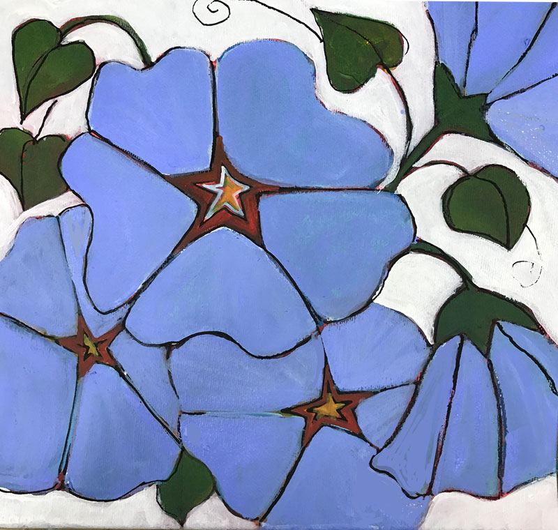
If flowers are my current focus, the color blue has been a constant inspiration throughout my work throughout this year.
This summer I taught a workshop for young teens on the Art of Fashion, this time teamed up with another instructor whose focus is natural dyes. She grows indigo and madder in her garden, and uses her plants to teach about dying and printing on fabric. Our collaboration resulted in a fascination with indigo – and the resulting blues it can create.
To prepare to teach my section of the workshop –which includes illustrating clothing designs and creating fabric designs and patterns, I spent time learning about not only indigo but many other blue pigments – and experimenting them in my work.
I’ve always been curious about the sources of pigments used by artists f the past - those who could not just hop to the art store for supplies. What I learned through Google searches and books, was a great enhancement to my understanding, my classes, and my respect for the incredible amount of work needed to create colors for paints and dyes.
Today's painting combines blue and florals - and is part of the series I am developing. The fashion figure is the work of a student who painted a pattern on paper and turned it into the fabric for her dress design. Good work.

Thursday, November 10, 2016

J is for Just Do It

On this day of jangled nerves, jumbled thoughts and jagged emotions, I am not feeling especially creative. But, because a promise to work this challenge every day is a promise, I know I need to just do something.

Flowers are calm, blue is both beautiful and reflects my mood. This is a small drawing - Caran D'ache on heavy watercolor paper. I tweaked the texture in Photoshop because I can,


Friday, November 21, 2014

U is for Ultramarine

Ultramarine is a deep blue color and a pigment which was originally made by grinding lapis lazuli into a powder.[1] The name comes from the Latin ultramarinus, literally "beyond the sea", because the pigment was imported into Europe from mines in Afghanistan by Italian traders during the 14th and 15th century.

Ultramarine was the finest and most expensive blue used by Renaissance painters. It was often used for the robes of the Virgin Mary, and symbolized holiness and humility. It remained an extremely expensive pigment until a synthetic ultramarine was invented in 1826.

I was up until midnight last night trying to think of a way to incorporate U into my alphabet postings. One approach I use is to move through the alphabet, trying out each letter when placed after U. Up, ubiquitous, ugly, uncle, unite, umbrella, umbrage ... on and on. Eventually, and out of order, ultramarine arrived in my thoughts, and I slept.

Today I cropped part of one of my word/drawings and filled it with all shades of blue, including, of course, ultramarine. I love this color with connections to both the sea and jewels.

Thursday, November 15, 2012

O is for Orange

Tobi Kibel Piatek
Kitchen Window: Apricots in Blue 
I am off to an art show today, bringing a stack of paintings and lots of drawings all matted in classy black. Wish me luck. A portion of the proceeds will be donated to United Way - so its good for everybody.

This pastel painting is part of my Kitchen Window series. I put fruit into my blue bowl, arrange it around more of my blue glass pieces and set it in my sunny kitchen window to see what appears. I take lots of photos and then paint the ones that have the strongest contrast. Of course the warm complement of the orange apricots absolutely harmonize with the blues of the glass. The repeated round shapes and white lines add to the overall effect.

Wednesday, November 2, 2011

B: is for I've Got the Blues

I've got the blues alright ... Blues as in ultramarine, cobalt, phthalo, and prussian blue.

One of the most intriguing aspects of working in an abstract way, is the discovery of acrylic paints. My pastels have always arrived in a box, or have been hand selected from a display - their name meant nothing - they were reds, or darks or greys or ... I loved the colors, but what counted was not the name, only the shade, the brand and the type. Now, as I am beginning to experiment with acrylics - a world of poetry has opened up. I love the names, but this medium is a total stranger to me - a world to discover. My limited experience is teaching me that some acrylics are thick, some are transparent. Some work well when watered down, some make me feel like Van Gogh as they swirl and ooze on the canvas. One thing for sure - they are a challenge for me  - so I often find myself using digital paint tools to think about what I might paint, and to practice the effects I have in mind (but not yet in hand.)

Which brings me to today's post. This painting was done with MyPaint, an open-source graphics application for digital painters. I was able to really focus on layering the colors to get the effects I wanted ... all the blues were there - and I played with them all, without getting my hands dirty.  Now, if only I can learn to do this with those lovely blues ...