Showing posts with label abstract flowers. Show all posts

Wednesday, November 27, 2019

Aa is for Art Supplies

I always introduce an assortment of art supplies in my classes because I want my students to learn what each can do - pastels are rich in color but messy. Some love them (I do) but others hate the dust. Acrylic are always popular, as are acrylic pens. Actually, pens and markers of all sorts are among my favorites - and I've used several different types for the work I have created this month.

Extra fine sharpies in many colors are perfect for my line drawings - but have a limited variety of colors (especially if you use them often.) I love my two sided PrismaColor markers - but they are a little too heavy for the more delicate pieces I've been creating lately. One down-side of using any marker is worrying that the color will hold outa for the entire piece. Though this rarely happens, it is always a concern.

Last night I used Arteza Real Brush pens to color this one-line floral. These are blendable, water-based ink. Thanks to my generous husband I have a set of 48 colors. A wonderful array. I like the tip which is essentially a brush and can be used for narrow lines or wide spaces, and can be worked with water. These were fun to use and I am happy with the warm colors I used.

Tuesday, November 26, 2019

Z is for Zooming through November

I'm up to Z - its almost Thanksgiving. Time is flying.

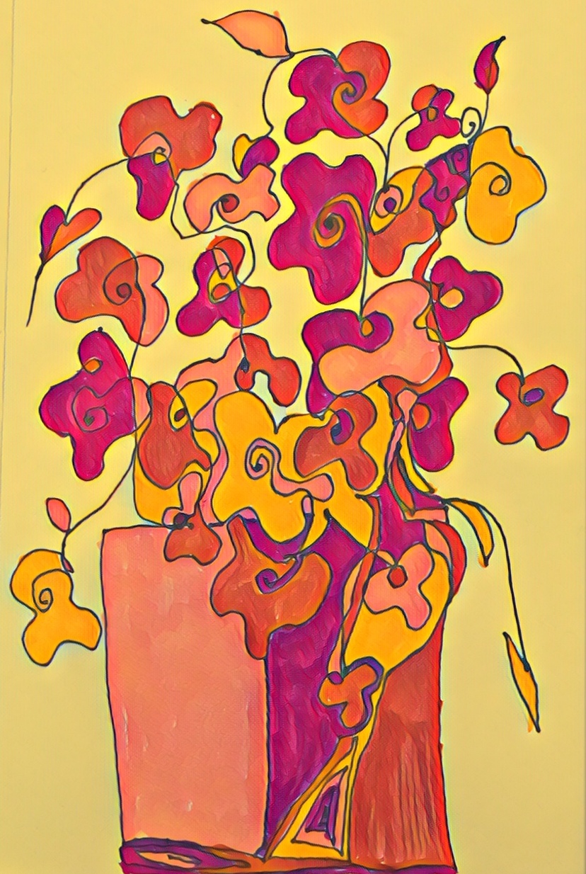
On this busy day, I made some time to draw a series of  one-line images - using my floral paintings on the wall as inspiration.

 I liked the idea of using the one-line approach in a new way. My students will love this, too.

After drawing several sketches, I chose this one to fill with lines and color. I brought it into my digital tools to add a filter of color to enhance the autumn palette of the bouquet.

Friday, November 22, 2019

V

Being creative today was frustrating. I tried this and that. Tried to put anything to the letter V - violet came to mind but no idea came to back it up.

I poked around in some of my sketch books and came across a little line drawn floral. I used markers to color - but it was nothing special. I did another - still meh.

Finally, I  brought the image into my computer and messed around with different filters and tools. Now this I like. So - V is for very glad I'm done for today.


Thursday, November 21, 2019

U

I don't know what U is for today. I do know that when I sat down to make some art, this is what has appeared.

 This flower combines watercolor, pens, a pinch of salt and a tweak of digital. I had no plan, and I like the results. They, are unexpected.


Saturday, November 16, 2019

OP is for Orange Poppies

Okay, yesterday was O day - and though I did not have time to post, I did have time to create a
salad of bright orange carrots, and one of orzo. Today, I teach a painting class - so I guess P is covered too. In honor of both my busy schedule and my commitment to being creative everyday (playing with letters and fudging a commitment is creative right?) I offer (or present) Orange Poppies. This is in preparation for next weeks classes - florals are always popular.

This is a drawing done in color pencil and then tweaked in my digital tools.


Monday, November 5, 2018

E is for Exploration

Today's image is a drawing - typical of my style with drawing flowers - that I then worked on in Photoshop - exploring each of the available filters and combining some to create the eventual result - which I love.

Over the years, one of my favorite aspects of the everyday challenge is giving myself time to play with images to create something new. I have always loved my digital tools - and the freedom they allow me to create wild and beautiful new images from something I have created by hand.

Sunday, June 4, 2017

Hang 'Em High

It was hard work made light by six able hands, a good ladder, a tape measure and a level. Many thanks to Hanna Hofer (Programming/Public Relations) of the Canby Public Library for inviting me to show my work and helping to get it onto the walls.

Each time I hang my work the process is a little different , and is an opportunity to see the effects of different lighting and different arrangements on the paintings. In this open and airy space, it only took a little rearranging until we all seemed to agree that we had it right. Everything was in place.

 
Now all I need is eyes.

Art is a funny thing - it seems to me that either you see it or you don't. So many times I have watched people simply walk by work on walls - in shops, building corridors, offices and my home gallery - oblivious to the art. Hanging day was no different. As we worked people came in an out of the library - picking up and dropping off books, always stopping to glance at and sometimes watch the  large TV screen that graces a main wall (yes, that is the Donald on the screen (:-()), but no one stopped to look at the flowers. That was a disappointment. Nonetheless, I loved putting the labels on the wall and knowing that someone soon will see the art for what I intend it to be - joy on the walls.

The show will be in place until the end of July, Canby is a lovely town, the library (220 NE 2nd Ave, Canby, OR 97013 is great, and there are lots of things along way - dahlia farms, the fabulous ferry, peach orchards and a farm stand - so come on down. The ladies are waiting.


Saturday, November 26, 2016

Z is for buZZ

Today is Z day, and I have very little to say that relates to this difficult letter - but I do have this glorious rose drawing complete with buzzing bee to share.

This was drawn with color pencil on vellum and then I digitally added a color overlay to give it extra zip and zest.


Friday, November 25, 2016

Y is for Yesterday


Yesterday was Thanksgiving. It was a beautiful day if you don't count the torrential rains that fell throughout the day. They barely dampened the pleasures of my favorite holiday.

And, of course, dinner was delicious; the birthday boy was too.

Yesterday made me happy - so it is no surprise that the art that appeared today - a combination of painting and digital effects -  resulted in a garden of vibrant colors.

Wednesday, November 9, 2016

I is for Inspiration

It starts with an impulse to draw something -

As an art teacher I constantly think about ways to bring new ideas and techniques to my classes. I like to offer my students many alternatives for expressing their ideas. So we work in lots of different mediums and experiment with many different approaches.

The other day, as I was looking for a recipe in my Polish cookbook, I was instantly inspired by the beautiful paper cut patterns that decorate the pages.I had an idea.

In my classes, everybody likes to work with markers, and we have a good collection to work with in both places where I teach, so, instead of cooking, I grabbed my PrismaColor markers and played with the paper pattern ideas.

No matter what my intent, I find that working with markers always result in patterning with lines - before I knew it - I had a page filled with leaves and flowers -


Sunday, November 6, 2016

F is for Fracturing

I took a painting class this summer which included several lessons in fracturing images in the style of different artists.

 As a result, I have been intrigued by using lines to break up shapes - making them both more abstract, and yet staying true to their original form.

When I work in this way, I am confident that interesting things will result. This my artist's attitude of letting what wants to appear, happen onto the page.

This image is an experiment in fracturing simple flower forms. I think the colors - the compliments and the light and dark work well together.

I drew in Caran D'ache Watersoluble crayons and then wet all to create this watercolor feel.

Wednesday, November 11, 2015

K is for Kitchen Art

Kitchen art, for me, usually refers to a bowl of fruit or teapots or other cozy images that suit my favorite room. This piece may work in someone's kitchen, but it was created in mine.

One of the techniques I revisit from time to time is monotype printing. I have modified the more traditional approaches I have learned in classes and books to meet the needs of my senior students. It is so easy and so fun that I do it for myself whenever the urge hits.

But, because this method involves water, and soaked paper and spoons and a rolling pin (!) I find I do this best in my kitchen on the big counter under the lights.

This piece began as a drawing in caran d'ache neocolor watersoluble crayons on acetate. It is printed on wet cotton paper 9x12.

 It is always interesting to discover which details transfer over, which ones get lost, and how the changes effect the overall piece.


Tuesday, November 25, 2014

Y is for Yellow

This is just a little painting, 12"x12 but I think the color contrast and the way the flowers fill the frame make it seem bigger.

 I keep this one in my bedroom so that I can see its sunny face when I wake up. I love yellow and I love flowers.

Tuesday, November 18, 2014

R is for Red

Roses are red, and I live in the City of Roses, but I love amaryllis. Roses grow in my garden, but I grow amaryllis bulbs in a sunny garden window. They seem to thrive on my gardening style, also known as benign neglect.

Every year (not at Christmas when they are supposed to bloom, but in deep winter when their beauty and color are most needed)  they thrill me by producing a fabulous circle of huge, glorious red blooms. I have about ten plants that somehow manage to bloom in sequence (clever beauties.)

Year after year I photograph them from every angle and in every light. This piece, created by combining several photos, is my absolute favorite.

So, in honor of R day -  one of my favorite subjects - my beautiful amaryllis.

I love the abstract yet realistic effect - do you see this as flowers?

Friday, November 7, 2014

G is for Geraniums

I paint flowers. One room of my home is filled with bright bouquets on canvas.

Flowers add color and beauty. Their shapes are fascinating and ever changing.Though my painted flowers lack fragrance, they still add cheer and warmth to my home.

Looking at the collection of flower images I have created over the years, I seem to go through phases in floral design; sometimes flat and very abstract, sometimes rounder and fuller forms appear.

One of the ways I feel like I am growing (blooming?) as an artist is to practice drawing and sketching flower forms from life or books. When I feel like I understand the shapes and structure I like to simplifying them until the are abstract enough to appeal to my eye and yet "flowery" enough to read as something that actually grew in nature.

In this sketch I am trying to create flowers in different positions to add interest to the composition. I especially like the little red geranium clusters.

 This is watercolor and markers on cotton paper.


Sunday, November 2, 2014

B is for Background

I am experimenting with new ways to apply and work with acrylic paints. Thanks to methods I learn about in books such as Art Effects  by Jane Drysdale Green and in YouTube videos, I have been rubbing, scrubbing, scraping, sponging, salting and dabbing with alcohol. (Kinda like preparing a chicken.) The idea is to create an interesting background on which to develop the "stars" of the show.

Just to add to the challenge, I am doing this with old paintings that do not deserve canvas and closet space. These flowers were built on an abstract pattern that bored me. I began to layer paint and rub it back - a sort of glaze. As I repeated this process new lights and darks began to take shape. Suddenly, magically, a vase and flowers appeared. I am very happy with the results. I am fascinated by the background effects in the vase. Now the challenge is to figure out how to do this again.

This painting is 12"x12". Acrylic on canvas


Monday, November 18, 2013

R is for the Round Red Dot

One of my favorite lessons for young students came from a children's book I found on a random library search in a the school collection.

Apologies to the unknown author, and thanks, because that book proved a very fine inspiration for helping kids observe what is around them.

I no longer have the book, or even know its real title, but this sweet little book encouraged the children in the story to notice objects that were "As red and as round as a round red dot." I recall balls of red wool in a basket, and bright red apples on a tree.

I often send kids out with an assignment to spend a week noticing and listing all the things they observe that are as round and as red as a red dot.

The lists are amazing, because as time passes, eyes sharpen and those round red dots seem to  appear everywhere  - on pepperoni pizza, on Tylenol bottles, on dresses, on stop lights, and YAY, for me, on a painting in a show.

The round red dot means a piece of art has SOLD!!! So, needless to say, I am always looking out for my own. Here is one.

This painting of poppies in a blue jar  (18x24", acrylic on canvas) sold at the Lake Oswego Festival of the Arts. Seeing this round red dot has only made me hungry to see lots more.

Friday, November 15, 2013

O is for Once in a While - Collage

Every once in a while, often in a class, I am introduced to a totally new technique. Last spring, in a class on creativity, the assignment was to work with torn paper to create a collaged image - color optional.

I actually did this assignment three times. I addition to these sunflowers, I did a face and an abstract.

For inspiration, I found a large and very old sheet of thick cottony paper in my stash. This had had been lightly drawn on long ago, and was not nice enough to use for any other project.

Though I knew any paper might be used to interesting effect, this thick and heavy stuff promised a good result because it tore into rough soft edges which allowed me to fit them, like a mosaic into a drawing on canvas.

This was the ultimate in sticky finger projects, but by using gel medium, applied with a paint brush in thin layers, I soon discovered that I could both fit and layer the tiny paper pieces to create both shape and texture. I also chose to add some color into the background that would show through.

This was painstaking and tedious work, but I just loved listening to music and playing around to build each work. It is unlike my other work, and therefore a fun thing to do, once in a while.

18"x24" on canvas

Thursday, November 29, 2012

Cc is for Clematis and Color

The end is near, two more days to go. I am on a tear with my new inspiration. Today's work is a drawing of a clematis enhanced with zentangle patterns.

However, I got a new pen today, and when I added a touch of color to the background with inktense pencil and water, the ink ran. BOOOO.

If I have learned anything in my life, it is that mistakes and problems are often the gateway to new discoveries and highly satisfying solutions. So....

A little help from my digital pal Photoshop allowed me to drop out the background. Then I added a gradient layer, just to try, and knew this was the background intended to go with this flower.

My final November post will appear on Saturday ... then, on to who knows what.


Wednesday, November 28, 2012

Bb is for Bold Blooms

I am inspired. The combination of flowers, lines, zentangle patterns and time to be creative allowed me to spend an entire day at work on this. I love the foreground flowers and the leaves, and the little patterns near the table top. Oh, and zoom in on the vase.

This is fine point markers, black and color, and inktense pencil for some POP. 9x12 on watercolor paper.

More tomorrow. Its great to have something new to focus on.